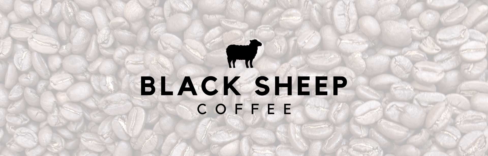
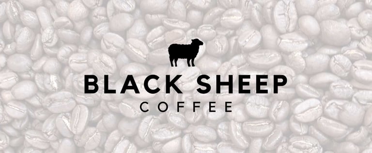
Black Sheep Coffee
Building an adaptable brand language for a fast-moving local coffee shop.
The Opportunity: Black Sheep Coffee had strong local recognition, but their visual presence lacked consistency. As new drinks, promotions, and seasonal specials rolled out, the team often had to reinvent the wheel each time they created marketing materials. They needed a refined logo and a cohesive brand system that felt bold and recognizable — while being flexible enough for daily use across menus, social media, and in-store promotions.
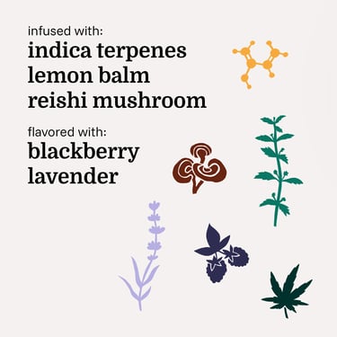
The Solution: The logo was refined to strengthen clarity and consistency, and a more defined brand identity was developed to guide typography, color, and layout decisions. An ongoing icon illustration series and photo style was created for specialty drinks and social content, giving the team a distinctive visual language to build from. The result is an adaptable system that empowers the staff to create on-brand materials quickly and confidently without starting from scratch.
The Scope:
Brand Identity
Menu Design
Illustration
Iconography
Social Media
Photography


Work | Services | About | Start a Project | Newsletter | Shop
Copyright 2026 Katdog Design
Let's Create Something Awesome!
Working with clients across the globe, locally in Minneapolis / St. Paul, and across Minnesota and the Midwest.